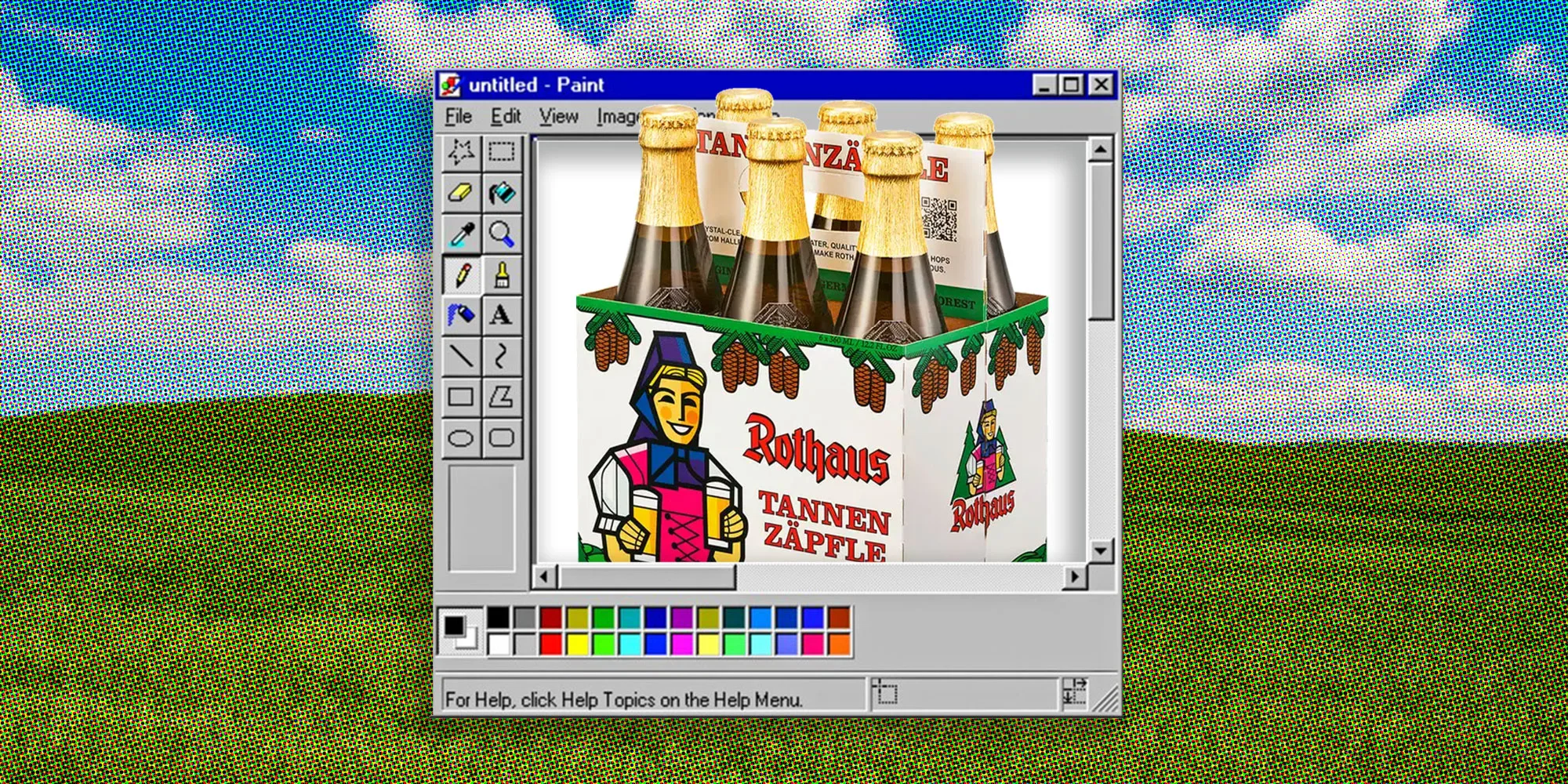
No one interviewed for this story says they don’t actually like it. Tobias Holler, who is largely responsible for bringing it to the U.S. in the first place, uses the tactful word “dated” before describing how nice the glass, the foil, the paper is — basically everything except the thing itself. And Mandy Naglich, author of the recent book “How to Taste” who’s been brewing and writing about beer for years, says it looks like something you might design if you knew absolutely nothing about design. Like “you tried to make an invitation on your computer or in Microsoft Word or something,” she says. “Or a bad billboard.”
The thing they’re talking about is the label design for German brewery Rothaus. For decades now, the artwork affixed to every bottle in every style they brew has been a bold, modernist island in a sea of bucolic realism.
Most beers from that part of the world feature coats of arms or charming Bavarian architecture in a distinctive style that’s almost become visual shorthand for “this is from Germany.” Rothaus, on the other hand, sports a brazenly minimalist assemblage of sharply angled, brightly colored shapes. They come together to form a woman in a pink tunic standing next to some pinecones, holding two beers, and positively beaming at the viewer. Her fans — and there are plenty — have named her “Biergit Kraft,” a local play on words that translates to “beer gives you power.” For the first 16 years of her


